How Open Eyes and Open Minds Can Prevent Layout Disasters
My first job with a magazine was eye opening. Back then, there was a staff of proofreaders to make sure there were no typos or grammatical mistakes, as opposed to now, where proofreading is no longer a priority. One weakness most magazines and newspapers had and still have, is no attention to how covers and spreads are laid out. The disasters that occur are hilarious and horrifying.
At my first job, one of my duties was helping the managing editor lay out the magazine on a wall with a grid made by black tape. I was to make copies of every page and every ad at 50% so they could be assigned a spot in the magazine. This story goes here, that ad goes there, etc. and so forth. It was a sort of puzzle-fitting and it took hours every night as the magazine grew to completion. It was tedious work and the layout changed every night, sometimes three, four or ten times as ad space was booked, stories were cut down or expanded. The managing editor and I were bleary-eyed when we would finally call it a night.
RELATED: Top 5 Sources to Download Free Software
Often, one of the changes we’d have to catch was the placement of the ads in relation to other ads or the editorial that faced the ad. “Here’s a spread with a DeBeers diamonds facing a Cadillac ad that says it’s the diamond of automobiles, right after an ad for diamond jewelry,” I commented during one lay out session, forcing us to start the puzzle-fitting all over again.
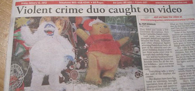
These days, this practice doesn’t go on. Publishers want it out fast, putting ten pounds of crap into a five pound bag, underestimating the intelligence of their customers, assuming they can’t or won’t notice the printed mistakes in the struggling medium of print. But, people do notice and that’s where these gems come in.
(Above) Since most people lay down a magazine, open to the page they are reading, it’s usually a good idea to make sure the back cover compliments the front cover. (Below) Dream vacation, vacation horror and a man looking on, screaming. What a layout disaster!
Did no one notice the word formed by the reflection? Major fail!
A spread has the potential for a disaster. Look at how facing pages are laid out.
RELATED: Leveraging the Press Release as an SEO Tool
Once again, ignoring the placement of stories and ads leads to embarrassment.
Oh, YIKES! Facing ads form one big visual image. Are the people in different ads facing each other, mixing emotions or pooping in another’s drink?
When you start covering part of your logo, you should probably take a second look, as the people at Where magazine did not. Maybe it’s just a design makeover relaunch?
(Lower left) Oh, how every good photographer looks for the special moment to catch a shot like this. When you buy the wrong shot, just pay for a little Photoshop work… unless you hate that politician.
Someone was asleep from design to printing. It’s one thing that proofreaders have been removed from the process of publishing quality but “rapefruit,” “click here” in a print ad, and forgetting to insert a major headline? Honestly! Were people fired after these fails?
When you are the advertiser, you should be stricter about ad placement. Then again, they say any advertising beyond what is paid for is “good advertising.” Still, a McDonald’s ad on a public bathroom reading “worth the mess” is a classic fail.
RELATED: Choosing a Web Hosting Company
Another consideration is WHERE your ad will be posted. Think of the environment, texture, the surroundings and how will your ad look once posted.
A brilliant use of two billboards is to double the focus time for a single message.
Although the top ad uses a fake ad to back up the message, the bottom ad uses guerilla marketing to take advantage of other real ads to drive it’s message.
Ambient ads make use of the environment around them. An open eye and an open mind create a great mix of two or more existing things to make a strong ad.
It’s rare that the blunders shown in the beginning of the article can become a winning ad or message but there are people who have a creative sense, and see possibilities all around them. In any media, be it print or digital, it’s important to remember how people will view posters, billboards, spreads in newspapers and magazines. See the bigger picture and design for success.
